Before diving into the visual design of a Software as a Service (SaaS) user interface (UI), we sketch out ideas to create concepts and contemplate basic functionalities. The aim is to roughly envision the final product and steer the design process in the right direction. To achieve this, we create wireframes (also known as low-fidelity mockups) and prototypes. But what exactly is a wireframe? How does it differ from a prototype? And why and how do we create them?
Table of contents
Definition
What is a wireframe and what is its purpose? A wireframe, is essentially a simplified representation of an interface. Whether created by hand or electronically, these schematics primarily consist of lines and text, without visuals or colors. They can be static or responsive, and their content may vary depending on the needs.
- Wireframes are often referred to as wireframe mockups, but it is crucial not to confuse them with high-fidelity prototypes, which provide a much higher level of detail.
- The focus is on content, information hierarchy, structure, functions, and navigation. They are primarily used to brainstorm content and interaction, setting aside aesthetic details.
- These static grayscale mockups are non-functional and do not consider graphical considerations. Content is suggested but not included, and as we iterate, we refine these mockups.
Difference between Wireframes, UI Mockups, Prototypes
All wireframes can be considered UI mockups or low-fidelity prototypes without too much detail, but not all prototypes are necessarily wireframes. High-fidelity prototypes visually represent the product in great detail, almost similar to the final product outcome. They are somewhat advanced wireframes.
Importance of Wireframes
Wireframes are essential for exploring various ideas by providing a basic representation of concepts. This exploration phase, usually conducted through design workshops, helps in choosing the right path before diving into more detailed prototypes. Thus, wireframes help avoid costly mistakes in resources by identifying wrong directions early on, providing a solid foundation for the design process.
Low-Fidelity Wireframes: Concise Sketches for an Overview
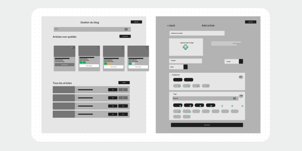
Low-fidelity wireframes (low-fi) stand out for their simplicity, often drawn by hand with paper and pencil or with minimalist digital tools. Limited to two colors, black on white, these schematics focus on the overall layout of the interface, avoiding unnecessary details. They essentially consist of boxes, text, and lines, without visual representation of images, which can make them quite abstract at first glance.
These sketches serve as a starting point before embarking on the visual design phase of the interface, offering a quick and accessible approach to sketch out initial ideas.
In addition to the traditional paper and pencil, digital tools are also available, allowing even the adjustment of element sizes for quick tests.
The primary goal is to create a first draft quickly and efficiently, to save time in the subsequent stages of more detailed design.

Advantages of Low-Fidelity Wireframes
- Easy to create and understand: Their simplicity makes them accessible to all team members, even those less familiar with UX design.
- Tangible first impression: Offer a first concrete vision of the interface, allowing clients or hierarchical managers to give their feedback quickly.
- Team alignment: By starting with these sketches, every design team member is on the same page from the start, thus avoiding investing resources in a design that may be changed later.
- Cost-effective: Given their simplicity and the few resources required, low-fi wireframes are economical to produce, which is particularly advantageous for small businesses or projects with limited budgets.
- Rapid iteration: Their limited design allows for rapid iteration cycles, which is essential in the exploratory phases of the design process, where ideas evolve quickly.
- Focus on structure: By focusing solely on layout and structure, low-fi wireframes help identify design gaps effectively before investing time in visual details.
Disadvantages of Low-Fidelity Wireframes
- Variable drawing skills: The quality of drawings may vary depending on individual skills, which can sometimes make understanding difficult for clients or other stakeholders in the creation process.
- Lack of detail: Due to their simplistic nature, low-fi wireframes may sometimes fail to capture all aspects of the user experience, which can lead to design gaps not evident at the wireframe stage.
- Subjective interpretation: The simplicity of low-fi wireframes can lead to subjective interpretation from stakeholders, which can sometimes lead to divergent opinions on the direction to take.
- Difficulty visualizing the final product: For some clients or stakeholders, low-fi wireframes may not suffice to fully communicate the appearance and usability of the final product, which can lead to unrealistic expectations or misunderstandings.
Medium-Fidelity Wireframes: Precise Visual Hierarchy
Medium-fidelity wireframes (medium-fi) represent an intermediate step in the design process, characterized by the use of specialized tools rather than traditional paper and pencil.
Unlike low-fi wireframes, which are limited to two colors, medium-fi wireframes incorporate a range of grayscale to better define the visual hierarchy of elements. This approach helps to further specify the layout of components and provide a first impression of the overall aesthetics of the interface.
By using dedicated design software, designers can quickly iterate through different versions while benefiting from additional features such as creating reusable components and automatic alignment of elements.
This method thus offers a compromise between the simplicity of low-fi wireframes and the higher level of detail of high-fidelity mockups, allowing for rapid validation of the interface structure and flow while paving the way for more extensive iterations.

Advantages of Medium-Fidelity Wireframes
- Enhanced visual hierarchy: By using grayscale tones and specialized design tools, medium-fidelity wireframes allow for better definition of the visual hierarchy of elements, facilitating understanding of the interface structure.
- Iteration ease: Design software offers advanced features for quickly iterating through different wireframe versions, allowing designers to test and refine their ideas quickly.
- More realistic approach: By incorporating more precise visual elements than low-fi wireframes, medium-fi wireframes offer a more realistic first impression of the final appearance of the interface, facilitating discussions with clients and stakeholders.
Disadvantages of Medium-Fidelity Wireframes
- Time and resource investment: Creating medium-fidelity wireframes may require more time and resources than low-fi wireframes due to the use of specialized tools and the increased precision required in design.
- Risk of excessive focus on details: With more precise visual elements, there is a risk of focusing too early on aesthetic details, which can delay the design process and limit creativity.
- Communication complexity: Although more detailed than low-fi wireframes, medium-fi wireframes may still require thorough explanation to ensure clear understanding by clients and stakeholders, which can sometimes lead to misunderstandings.
Advanced UI Mockups or Prototypes: High-Fidelity Wireframes
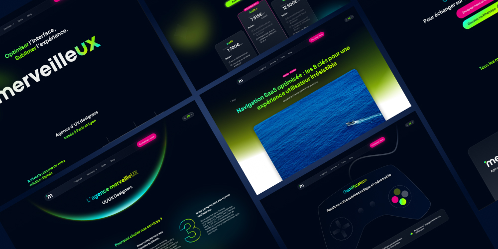
High-fidelity wireframes (hi-fi) are rather considered as UI mockups or prototypes. They represent the epitome of realism in the design process, offering an extremely faithful representation of content and user interface (UI). Unlike low-fi and medium-fi wireframes, these mockups incorporate detailed components, specific fonts, real images, and authentic text, thus offering a visual experience close to that of the final interface. UX writing, user experience-focused writing, is also fine-tuned at this stage, contributing to strengthening the realistic aspect of the mockup.
Used at an advanced stage of the design process, high-fi wireframes require the use of specialized design software for their realization. These mockups are so detailed that they can be mistaken for a screenshot of the final interface. Each element is meticulously designed to faithfully reflect the product vision, thus providing a tangible representation of the upcoming user experience.
By integrating realistic visual details, high-fi wireframes facilitate communication with stakeholders by providing a concrete vision of the final interface, while allowing designers to refine the final details before development.

Advantages of High-Fidelity Wireframes
- Increased realism: High-fidelity wireframes offer an extremely realistic representation of the user interface, allowing clients and stakeholders to easily visualize the final product appearance.
- Better understanding of user experience: With detailed components, specific fonts, and real content, high-fi wireframes allow for a comprehensive understanding of the user experience, facilitating discussions and decision-making.
- Validation of final concept: By faithfully simulating the final interface, high-fi wireframes allow for concept validation and identification of any UX issues before development, saving time and resources.
Disadvantages of High-Fidelity Wireframes
- Time and resource investment: Creating high-fidelity wireframes requires more time and resources due to their high level of detail, making the design process more costly and time-consuming.
- Difficulty in modification: Due to their complexity, high-fi wireframes can be more difficult to modify than less detailed versions, which can limit the flexibility and responsiveness of the design process.
- Confusion with final interface: Due to their realism, high-fi wireframes may be mistaken for the final interface, which can lead to unrealistic expectations from clients or end users.
How to Create UI/UX Wireframes for SaaS?
1. Properly Plan Your Design
In order to efficiently create wireframes for a SaaS interface, we will revisit the UX Research phase and ask the right questions to properly plan the interface design: Who is the audience? What are the objectives? What questions will the wireframes answer? Do I have enough data? Sometimes, outsourcing UX Design can be the best solution.
Once we are ready, we can choose the appropriate tool.
2. Choose the Right Tools
Once we have developed and understood the needs of our users well, completed all the previous steps in wireframe design, we will choose the tools we will use to create wireframes for our future SaaS interface or module.
- Paper and pen: as mentioned above, these basics are perfect for low-fi wireframes.
- Wireframing software: Figma, Sketch, Adobe XD. These interface design dedicated software are the best solution for interface mockups. Low-fi wireframes can be created on a tablet with the software's application, while more precise design can be easily done on a computer.
- Artificial intelligence: some online solutions allow you to develop wireframes directly from their interface, through a prompt. It can be useful to save time, but this method is more suitable for web design. Custom SaaS software design requires more follow-up from a human brain through a UX method.
- Paper stencils and cutouts: this method involves the use of paper/cardboard cutouts and creation by moving and assembling elements. You can make your own stencils or buy them online.
- Design software: Photoshop, Illustrator, or Canva are tools that can be used to create wireframes. They are not the most suitable for hi-fi wireframes, but can do the job for low-fi or medium-fi wireframes.
Conclusion
In the complex world of user interface design, wireframes play an essential role as the foundation on which the most successful digital products are built. Their apparent simplicity hides a depth of analysis and reflection that guides every step of the design process.
Thus, whether you are a novice in the field of UX design or a seasoned expert, never forget the fundamental importance of wireframes in creating remarkable SaaS products.
 Diagnostic UX


