Picture this: A seasoned HR manager, used to navigating the labyrinthine depths of enterprise software, suddenly finds herself adrift in the sleek, minimalist world of a dating app. Simple icons, streamlined features, casual language… it’s a whole new (and surprisingly delightful) ballgame. Meanwhile, a recent grad and avid gamer stares blankly at the screen of a complex accounting software. Spreadsheets, dropdowns, and a barrage of technical jargon leave her feeling utterly lost.It's a funny contrast, right? While B2B and B2C might seem like polar opposites at first glance, it's time to move beyond the stereotypes. Because behind these apparent differences lie valuable lessons for Software as a Service (SaaS) development. Business-to-Business (B2B) UX, often focused on efficiency and customization, could benefit from the simplicity and engagement of Business-to-Consumer (B2C) design. Conversely, B2C could learn a thing or two from the pragmatism and rich functionality of B2B.So, how can we create SaaS products that leverage the best of both worlds?
Table of contents
What the B2B World Can Learn from the Dynamism of B2C
While B2B often excels at creating powerful and customizable tools, it's fair to say that user-friendliness isn't always its strong suit. This is where B2C comes in, with its approach firmly focused on simplicity and user engagement. Far from being superficial, these qualities have become essential in an era where users, even in a professional setting, are looking for smooth and enjoyable experiences.
Lesson 1. Simplicity and Clarity: The Cornerstones of Successful UX
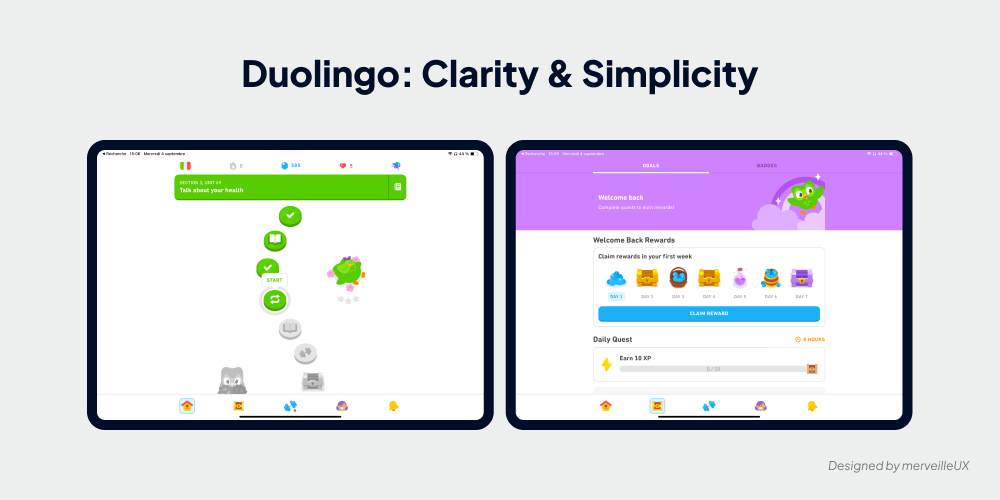
Take Duolingo, the mobile app that has won over millions of users with its fun and accessible language learning method. Its success is largely due to its ability to make learning simple and intuitive, right from the moment the app is launched. The clean, colorful interface guides the user step-by-step, without ever overwhelming them with a flood of unnecessary information.
B2B SaaS would do well to draw inspiration from this "mobile-first" approach to design interfaces that focus on the essentials. How?
- By prioritizing information: Duolingo highlights key lessons and the most relevant exercises. B2B SaaS can learn from this by highlighting key features and the most important data, relegating secondary options to the background.
- By using clear and concise language: Duolingo banishes technical jargon and uses simple and engaging language. Similarly, B2B applications would benefit from using simple terms that everyone can understand.
- By offering linear and intuitive user journeys: Duolingo guides the user step-by-step, minimizing distractions. B2B SaaS can take inspiration from this by offering logical and intuitive journeys within its applications.
In short, it's all about applying the "less is more" principle to provide B2B users with a smooth and efficient user experience, even when it comes to managing complex tasks.
Discover the 8 UX laws you need to know for a successful SaaS. And to avoid common mistakes, browse our article dedicated to the 10 navigation UX errors that drive users away.
Lesson 2. Engage and Motivate with Gamification
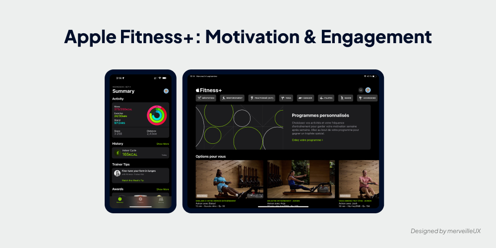
You don't have to look far to find examples of successful Gamification! Apple understands this well and integrates it subtly into its ecosystem, notably with the Apple Watch and Apple Fitness+.
Take the example of the Activity rings on the Apple Watch. This system of concentric circles that fill up as the user reaches their daily goals for movement, exercise, and standing is a model of effective gamification. Easy to understand, visually appealing, and incredibly motivating, it encourages users to move more, almost without realizing it.
Similarly, Apple Fitness+ uses the "burn bar", a progress bar that fills up based on the intensity of effort and other users, to keep users motivated during their workouts. The goal? To encourage them to push themselves further, "burn" as many calories as possible, and reach the top of the leaderboard.
Lessons for B2B:
- Simplicity and clarity: Like the Activity rings, B2B SaaS gamification mechanics need to be easy to understand and use.
- Progress visualization: Offer users visually appealing and engaging tools to track their progress and visualize their achievements.
- Sense of community and emulation: Encourage interaction and healthy competition between colleagues (leaderboards, team challenges, etc.) to boost engagement.
- Rewards and recognition: Celebrate user successes with congratulatory messages, badges, experience points, or unlockable features.
By integrating gamification elements inspired by these examples, B2B can create more engaging, motivating, and rewarding user experiences while maintaining a professional and relevant approach. However, it needs to be integrated subtly! Learn more about the secrets of addictive platforms in our dedicated article on SaaS gamification.
Lesson 3. Humanize the Experience and Cultivate Listening for a Constantly Evolving UX
Forget the image of cold, impersonal B2B software! B2C shows us that a successful user experience also relies on emotion and proximity to the user. Take the example of Spotify, the music streaming giant that has won the hearts of millions of users.
Beyond its recommendation algorithms, Spotify has implemented a true culture of listening and dialogue with its users. How?
- Multiple feedback channels: Integrated forms, satisfaction surveys, usage analyses... Spotify makes every effort to gather the opinions and suggestions of its users.
- Concrete actions: Spotify doesn't just listen, it acts! User feedback is systematically analyzed and taken into account to improve the application.
- Continuous improvement: Intuitive ergonomics, new features, rapid bug resolution... Spotify is constantly evolving, adapting its interface to the real needs of its users.
B2B has every interest in drawing inspiration from this "user-centric" approach. By integrating human connection and continuous feedback into the heart of UX design, SaaS can move from the status of a cold, impersonal tool to that of a true everyday partner. Listening to users is essential to create successful SaaS. Discover how UX Research maximizes your product's chances of success. The goal: to create lasting relationships based on listening, trust, and continuous improvement.
Lesson 4. "No Strings Attached": What if We Stopped Holding B2B Subscriptions Hostage?
We all know that B2B loves its commitment contracts, its signatures in good and due form. But in the age of "everything, right now" and "no commitment," this "old-fashioned" approach is showing its limitations. B2C, with its "no strings attached" philosophy, has understood that a free user is a happy user (and more likely to stay!).
Look at Netflix: no commitment, the ability to cancel with one click, and yet, who seriously considers going without their favorite shows each month? Their secret? An experience so addictive that you want more!
So, dear friends of B2B, what if we stopped holding subscriptions hostage? Dare to embrace flexibility, trust, and a "win-win" relationship!
How? By focusing on:
- New generation subscriptions: Flexible, modular, with no commitment (or almost!). The idea? Adapt to the needs of businesses, not the other way around.
- Added value that rocks: Forget basic features. Offer something substantial, concrete, and indispensable! Premium services, exclusive content, top-notch support... Give them a real reason to stay.
- A close relationship, not robots: Listen to your users, integrate their feedback, communicate transparently... In short, become partners, not just suppliers.
By focusing on user satisfaction and creating a healthy, balanced relationship, B2B can transform the subscription into a true growth engine and say goodbye to massive churn.
Outsourcing your UX Design can be an effective solution to reduce churn and optimize your budget. Discover how in our dedicated article.
When B2C Takes Inspiration from B2B's Pragmatism: Towards Richer and More Personalized Experiences
While B2C excels at creating simple and engaging user experiences, it can sometimes get carried away with its desire for simplicity at the expense of depth and personalization. This is where B2B, with its in-depth understanding of business needs, can bring valuable insight. Far from being limited to austere interfaces, B2B has developed powerful and highly customizable solutions capable of meeting the requirements of each user. Let's explore this in 3 lessons.
Lesson 1. Efficiency and Personalization: Going Beyond the "One-Size-Fits-All" Approach
Take the example of customer relationship management (CRM) software, essential tools for businesses that want to manage their customer interactions effectively. This software allows companies to centralize customer data, automate marketing and sales tasks, and personalize customer relationships on a large scale.
The strength of CRMs? Their ability to adapt to the specific needs of each company and each user, far from the "one-size-fits-all" approach often favored in B2C.
How can B2C draw inspiration from this approach?
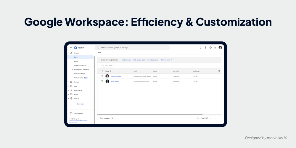
- Offer advanced customization options: Allow users to configure the application according to their preferences (theme, language, notifications, features...).
- Segment the audience and personalize the experience: Offer content, features, or offers tailored to the needs and interests of each user (e.g., personalized recommendations, unlockable features based on profile).
- Give users control: Allow users to easily manage their data, choose their privacy preferences, and modify their subscription.
By offering a more personalized and flexible experience, B2C applications can better meet user expectations and strengthen long-term engagement. Moreover, the Design System is a major asset for creating scalable and efficient SaaS. Dive into the heart of this methodology in our dedicated article.
Lesson 2. Collaboration and Role Management: Inspiring Multi-User Interactions in B2C
When we think of B2B, we often picture open-plan offices and endless meetings. Certainly, collaboration is the key word in the professional world, and B2B tools have developed cutting-edge features to facilitate teamwork.
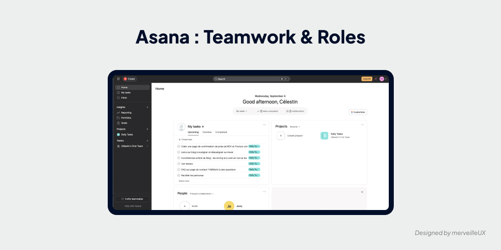
Take project management platforms like Asana: a true collaborative playground where everyone can track task progress, share documents, and communicate in real time. Creating shared workspaces, assigning specific roles, visualizing overall progress... B2B has thought of everything to streamline interactions and boost collective efficiency.
But who said B2C should stay away from this collaborative revolution? Imagine:
- Dream family management apps: Forget arguments over groceries or exploding budgets! With B2B-inspired features, every family member can participate, track expenses, plan meals... Harmony reigns (finally!) in the home.
- Collaborative creation tools that boost productivity: Taking notes together, brainstorming in real time, co-creating content remotely... B2B leads the way for smoother and more user-friendly B2C applications, even with multiple users.
- Even more immersive multiplayer games: Integrated communication, collective progress tracking, team management... B2B's collaborative features can transform the multiplayer video game experience, much to the delight of gamers.
So, ready to bring a breath of fresh collaborative air to the B2C world? By drawing inspiration from the best of B2B, consumer applications can create richer, more engaging experiences that are in sync with today's collaborative lifestyles.
Lesson 3. Support and Documentation: Guiding and Supporting the User Beyond Intuitiveness
In the B2C world, intuitiveness reigns supreme. Applications must be easy to learn, without requiring lengthy tutorials or tedious searches in complex documentation. B2B, faced with often richer and more complex tools, has developed a different approach to user support.
Take the example of integrated management software (ERP). These tools, which cover all of a company's processes, are often perceived as overly complex, even by experienced users. To facilitate their adoption and ensure proper use, B2B software publishers rely on:
- Comprehensive and accessible documentation: Detailed user manuals, dynamic FAQs, video tutorials, contextual guides... The goal is to provide the user with an answer to every question, at every step of their journey.
- Responsive and personalized customer support: Telephone assistance, online chat, contact forms, community forums... Different channels are available to meet the specific needs of each user.
While B2C doesn't need to be bogged down with overly heavy documentation, it can draw inspiration from this "user-centric" approach to improve user support:
- Offer contextual and non-intrusive help: Integrate tooltips, interactive tutorials, or links to help pages within the interface itself, available only when the user needs them.
- Create attractive and educational help content: Favor short and visual formats (videos, animations, infographics, etc.) to explain complex features clearly and concisely.
- Encourage mutual support and knowledge sharing: Set up community forums, dynamic FAQs powered by users, or live chat systems to foster peer-to-peer exchange.
Powerful and engaging words can make all the difference! Discover how UX Writing can enhance your SaaS.
By combining intuition and personalized support, B2C can create even smoother and more enjoyable user experiences while meeting the needs of all users, even the least experienced.
Conclusion
UX Design is not a zero-sum game. Rather than opposing them, it's essential to perceive B2B and B2C approaches as complementary, each with its strengths and areas for improvement.
The future of SaaS lies at the intersection of these two worlds: powerful and intuitive interfaces that combine the simplicity and engagement of B2C with the rich functionality and customization of B2B. Tools designed to simplify users' daily lives, whether they are seasoned professionals or demanding individuals.
The stakes are high: transforming SaaS into true trusted partners, capable of adapting to everyone's needs, generating enthusiasm, and fostering long-term loyalty.
Do you dream of a SaaS that combines performance and user-friendliness, simplicity and power? Talk to our team of UX Design experts. Our Agency merveilleUX supports you in creating bespoke interfaces, designed for your users and your success.
Discover how our mockup and prototype services can bring your ideas to life! Explore our full range of design solutions and let our experts create custom mockups for your business. Ready to turn your concepts into reality?
 Diagnostic UX


