Human-machine interaction lies at the heart of the user experience (UX) of SaaS software. To create intuitive and seamless interfaces, it is crucial to understand how users perceive and interpret elements. Gestalt psychology, with its fundamental laws of perception, provides a valuable framework to guide the UX/UI design of SaaS.
Table of contents
Introduction
The Pioneers of Gestalt Psychology and Their Influence
At the beginning of the 20th century, Max Wertheimer, Kurt Koffka, and Wolfgang Köhler revolutionized psychology with Gestalt theory. They highlighted that human perception is holistic and not merely the sum of its parts. This approach had a major impact on various fields, including UX/UI design. Here are 8 laws to know in UI/UX Design.
1. Law of Proximity
The law of proximity demonstrates that elements close to each other are perceived as a group by the user. Our brain tends to associate elements within the same visual area, linking them and interpreting them as a coherent unit.
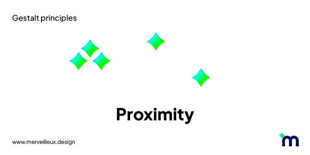
When navigating an interface, our visual system seeks cues to understand the structure and organization of information. Proximity is one of the most important cues for this purpose.
Application in UI/UX:
- Group functionally related elements.
- Use whitespace to separate sections.
- Arrange elements by order of importance.

Example: Uniform spacing between article cards creates a clear visual structure. It's easier to visualize the elements as a whole. This facilitates reading and understanding of the presented information. In contrast, inconsistent spacing between cards makes the overall perception confusing.
2. Law of Closure
Our brain loves completeness! This is the law of closure in action. We have a natural preference for closed and complete shapes.
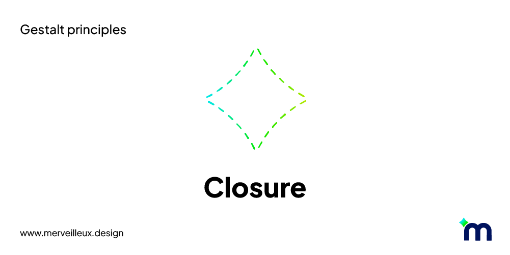
Instead of analyzing every detail, our visual system prefers to fill in the gaps between elements and perceive a whole image. This is how we first apprehend the entirety of a shape before focusing on its details.
Application in UI/UX:
- Use simple and recognizable shapes.
- Ensure elements are spaced enough to be distinguished.
- Use borders and contrasts to delineate areas.

Example: In carousel designs, the principle of closure is often exploited by showing only a small part of a carousel item. Even if users cannot guess the exact details of the partially displayed item, this incomplete portion indicates to them that there are other items beyond the visible edge.
3. Law of Similarity
The law of similarity emphasizes that elements sharing common characteristics such as shape, color, size, texture, or motion are perceived as a group by the user.
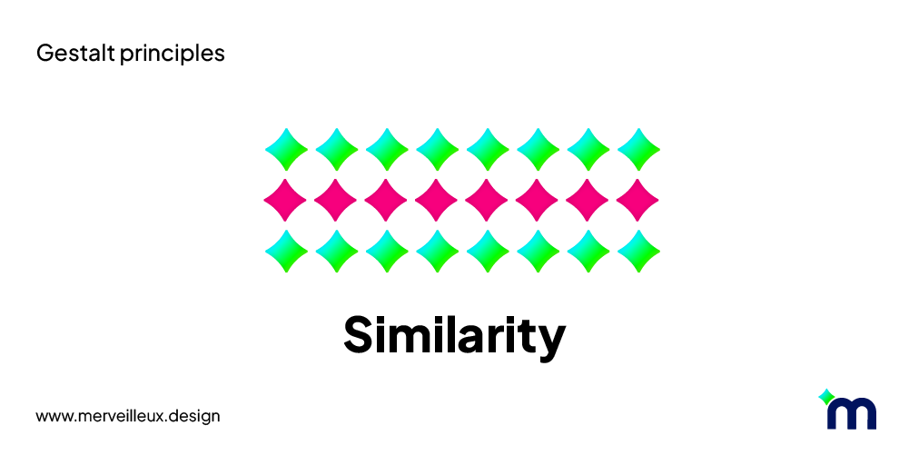
This principle relies on the pre-attentive processing of the human visual system, which automatically seeks patterns and structures in the environment.
Application in UI/UX:
- Use consistent colors and shapes to create visual hierarchy.
- Use similar typography for titles and paragraphs.
- Use icons and illustrations to enhance understanding.
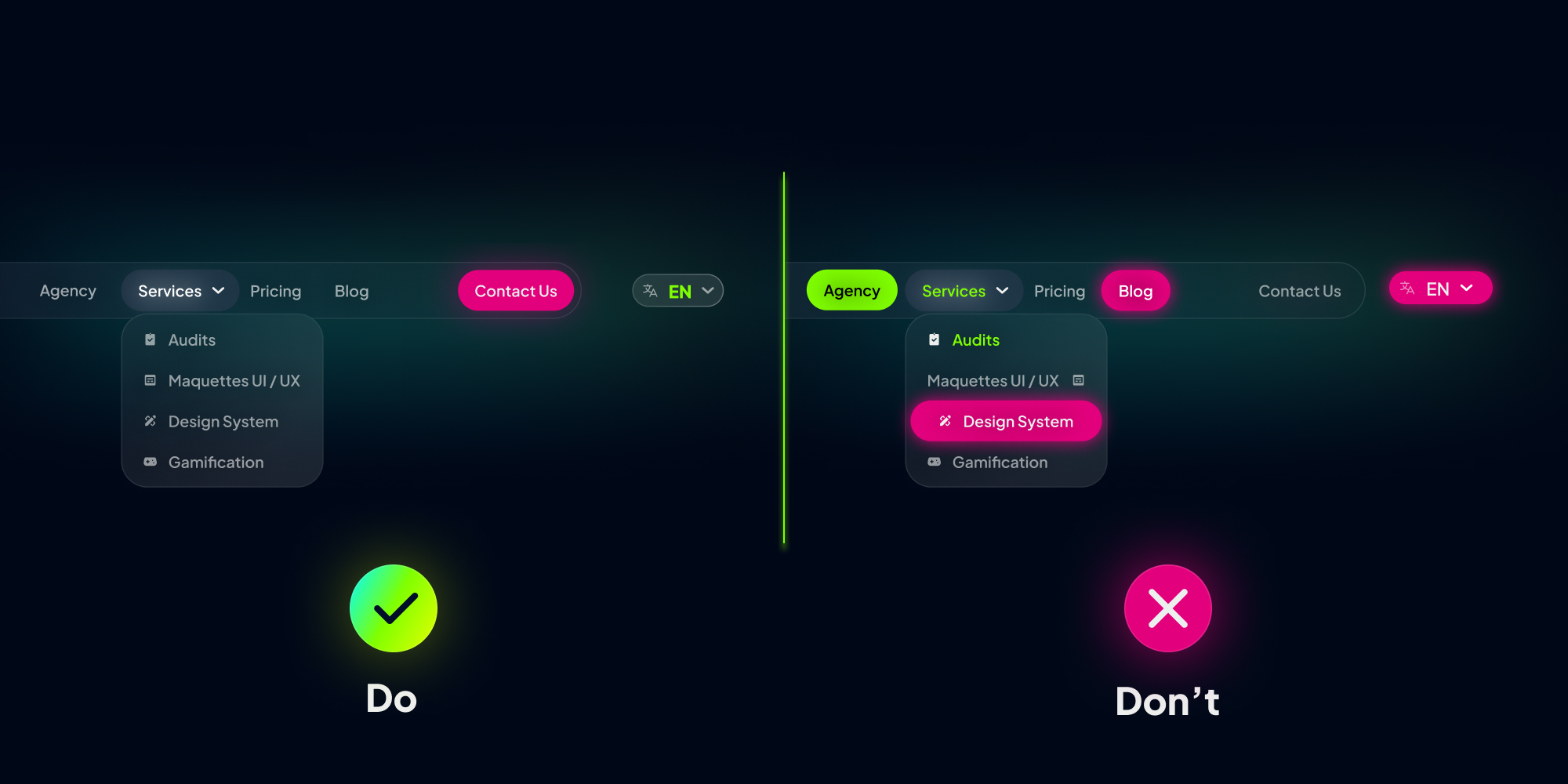
Example: In a menu bar, pages and sub-pages, serving the same navigation function, should be similar (font, color, shape). This similarity aids in recognizing and distinguishing groups of elements, optimizing user understanding and action speed. Similarly, the CTA stands out with its style to encourage action, while the language switch, with a different function, adopts a distinct style. Similarity creates visual consistency that guides users and allows them to navigate more easily.
4. Law of Common Region
The law of common region states that elements within the same area are perceived as a group, even if they are not necessarily close to each other. This law is related to visual perception and how our brain organizes visual information.
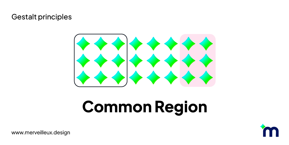
When observing an interface, our visual system looks for structures and relationships between elements. Common region is an important cue for this. Elements within the same area defined by a border, line, or color change are more likely to be perceived as a group, even if the distance between them is significant.
Application in UI/UX:
- Use containers to organize elements.
- Use contrasts to delineate areas.
- Use backgrounds to differentiate or group elements.
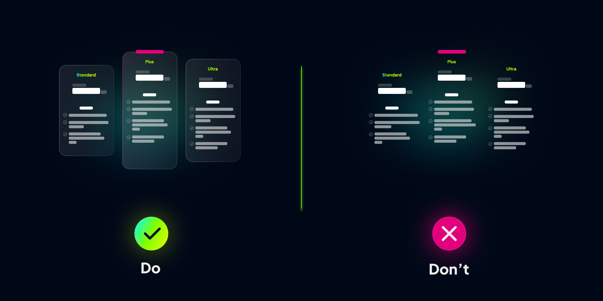
Example: In a pricing table, by grouping offers into distinct cards, a clear and precise visual structure is created. Each card becomes an autonomous region, grouping all the information related to an offer: price, benefits, visuals, etc. This grouping allows for better distinction of offers and facilitates comparison.
5. Law of Continuity
The law of continuity teaches us that our brain tends to naturally follow the direction suggested by an arrangement of objects. This tendency results in perceiving elements as extensions of each other. The eye naturally follows paths, lines, and curves, preferring to observe a consistent sequence in a shape or object, even if it's divided.
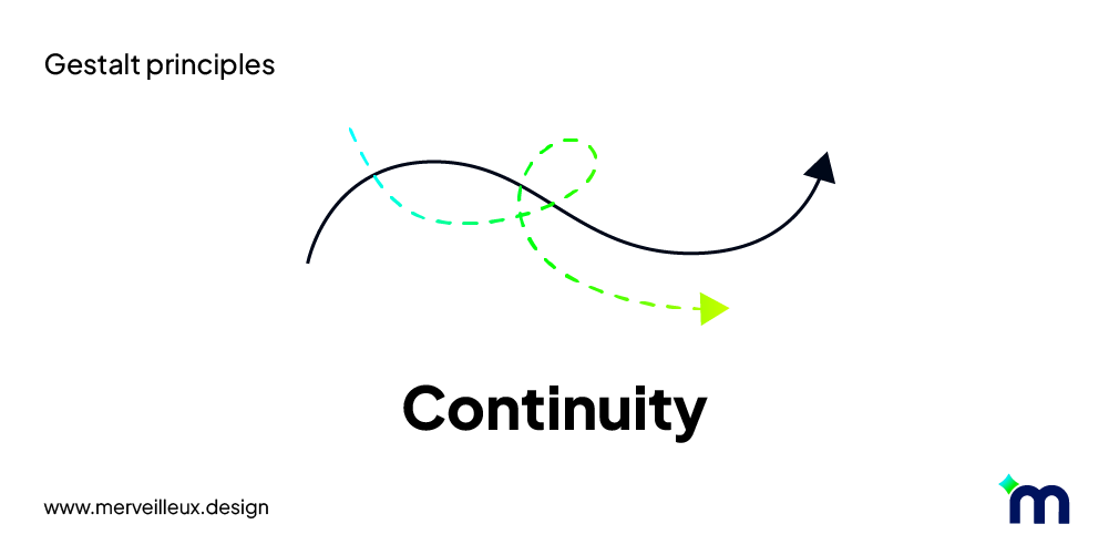
In other words, we are inclined to interpret visual elements as a fluid and coherent sequence, rather than a collection of disjointed elements.
Application in UI/UX:
- Use lines and arrows to guide the user's eye.
- Create visual links between elements.
- Use smooth animations for transitions.
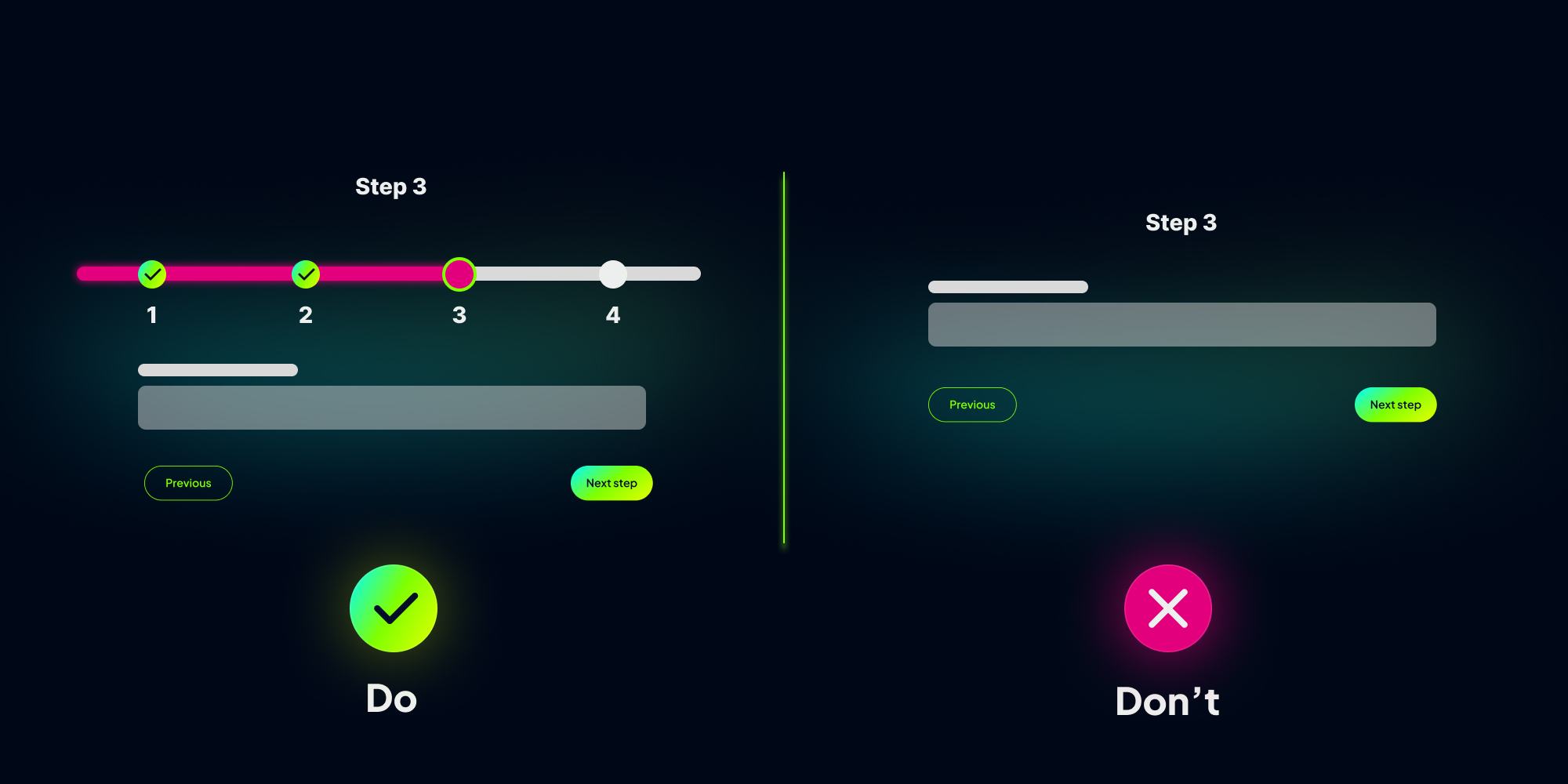
Example: The continuous line of a progress bar informs the user of their progress in a task, motivating them to continue. It acts as a guiding thread, smoothing the experience and encouraging completion. Visual continuity enhances user understanding and engagement.
6. Law of Good Figure
The figure-ground law describes our ability to distinguish an object from its surrounding context. Our visual system analyzes elements of a scene and separates them into two categories: the figure, representing the main object of our attention, and the ground, constituting the figure's environment.

When we observe an image, our brain looks for cues to determine which part is the figure and which part is the ground. This distinction is based on several factors such as contrast, familiarity, symmetry, and continuity.
Application in UI/UX:
- Use strong contrasts between important elements and the background.
- Use colors and shapes to create focal points.
- Ensure elements are spaced enough to be distinguished.

Example: A pop-up without background distinction gets lost in the information. The figure-ground law creates the necessary contrast: by blurring and reducing the brightness of the background, the pop-up becomes the dominant "figure." This visual contrast captures the user's attention and highlights the message, increasing the chances of reading and interaction.
7. Law of Symmetry
The law of symmetry states that elements arranged symmetrically are perceived as more harmonious, stable, and pleasing to the eye than asymmetrical elements. Our brain is naturally drawn to the order and regularity provided by symmetry.

Symmetry can be horizontal, vertical, or radial. It is found in nature, art, and design. When we observe a symmetrical shape, our brain tends to perceive it as a cohesive and balanced whole.
Application in UI/UX:
- Use symmetry to create a sense of balance and order.
- Center important elements.
- Use layout grids to align elements.
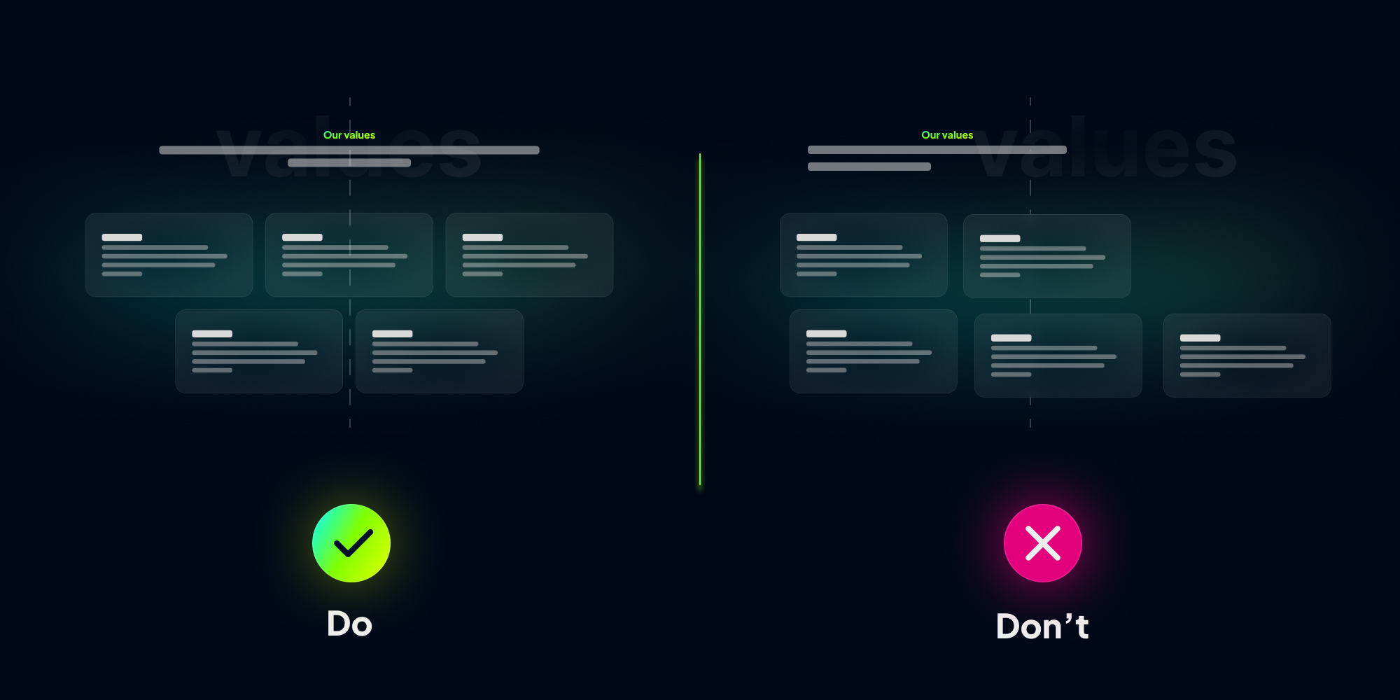
Example: In this example, by centering cards rather than aligning them left or right, a visual balance and a sense of harmony are created. This symmetry produces a visually pleasing composition, drawing attention to the content.
8. Law of Common Fate
The law of common fate states that elements that appear to move together or share a common motion are perceived as a group, even if they are not necessarily close to each other. Our brain tends to associate elements that seem to follow a common trajectory, linking them and interpreting them as a coherent unit.
When we observe a scene, our gaze is drawn to elements that move together. This perception is influenced by the direction of movement, speed, and cohesion of the group.
Application in UI/UX:
- Group elements that behave similarly.
- Use consistent transitions for page changes.

Example: Smooth animations, arrows indicating scroll direction, previews of neighboring elements, and page indicators create a collective movement. Users instinctively understand the scroll direction and the relationship between elements. This visual choreography stimulates interaction and discovery of carousel content.
Conclusion
By applying Gestalt laws to SaaS UX/UI design, designers can create more intuitive and user-friendly interfaces. This results in several benefits for users and businesses:
- Improved clarity and understanding: Clear and organized interfaces facilitate navigation and understanding of features. Users can find what they're looking for more quickly and accomplish their tasks more efficiently.
- Reduced cognitive load: By leveraging the brain's holistic perception abilities, Gestalt laws reduce users' cognitive load. Intuitive interfaces require less cognitive effort to understand, improving satisfaction and productivity.
- Enhanced user engagement: Aesthetic and harmonious interfaces, respecting Gestalt principles, are more enjoyable to use. This can lead to better user engagement, encouraging users to explore more of the SaaS features.
- Improved customer retention: A positive user experience is essential for customer retention. By applying Gestalt laws, SaaS can create intuitive and pleasant interfaces that encourage users to return and renew their subscriptions.
Gestalt psychology offers a valuable framework for designing intuitive and engaging SaaS interfaces. By applying its fundamental laws of perception, UX/UI designers can create clear, organized, and aesthetic interfaces that enhance user experience and contribute to the overall success of SaaS. However, it's important not to see Gestalt laws as a sole solution. By combining them with other UX design approaches and considering specific user needs, designers can create truly exceptional SaaS interfaces. And to understand how these psychological principles apply concretely to ergonomics, consult Nielsen's 10 heuristics.
At merveilleUX, a UX agency specialized in SaaS, Gestalt laws are not mere theories; they are the guiding principles of our approach to creating intuitive and engaging interfaces. Contact us today and let us guide you toward creating an optimized user experience.
 Diagnostic UX
